Below are analyses of my final product, I have circled certain elements on the existing products that I have followed and developed onto my final product. The colour of each circle matches each piece of text.
Below is a Prezi, displaying my front cover, Contents page and double page spread I have created. I have annotated it discribing how each element helps to reflect the emo/grunge/rock social group.
My magazine is a music theme with the particular genre of metal rock. The particular distribution that might distribute my magazine are supermarkets and local corner shops. Particularly corner shops as they sell a wide variety of magazines of all genres and due to it being peoples local corner shop it means that a different variety of people would go into the shop and if someone was going to buy a magazine they wouldn’t walk all the way to a supermarket just for that.
However supermarkets such as asda, Sainsbury’s etc might distribute it as they are well known and trusted companies whom have a magazine section. Due to the shop being bigger it means more people go there and would see the magazine,adding to this point if more people go there will be a greater income. Shops such as waterstones and whsmiths might distribute my magazine as they are well known and trusted companies. Along with this the main content in the store is book and stationary and magazines come under this genre. Although the magazine is not free it is £2.50 which will bring in an income for the shop as well as the magazine company.
When considering the fact that it is a music magazine it may be sold in music shops as it matches the genre. People in a music stores preferably enjoy music and if the mode of address and genre matches there taste then they would be more likely to buy it. A particular place my magazine may be distributed is Camden as it is known for its punk rock scene and has many music stores and punk clothing stores. Therefore my magazine can be distributed into one of these shops in Camden as the social groups in Camden would match the genre of my magazine therefore they are more likely to be interested. Gigs are a good place for my magazine to be distributed for if its a rock gig then everyone there would be interested in rock music therefore the magazine would match their taste. Aswell as this, in my magazine there are images of bands playing at gigs so the audience at the particular rock gig that my magazine is being distributed at might want to see an insight into what other bands are like live.
I have researched into what company I personally thought would distribute my magazine, through this research I came across, BAUER, a multinational media company headquartered in Germany which operates in 15 countries worldwide. Bauer magazine publish and distribute Kerrang and Q magazine, two very popular rock magazines. Due to the fact that these two magazines share the same genre I feel as this company would be perfect for my magazine. KerranG and Q are very successful magazines that have made it worldwide therefore, Bauer have the ability to do the same to ROAR magazine, bringing in a great profit and a large fan base. Click HERE forthe link to BAUER official website
Above is what a female who would reads my magazine is most likely to look like.
When considering the audience for my media product, its not just about the social groups its about the gender and the age. I personally feel that the target age is those 15-35, one reason for this is because of the mode of adress, some swear words occur within the article, these words would not be approprate for a younger audience however those 15-35 are most likely to swear. The content of the story is not acceptable fr those younger than 15, this is because it implies that school sucks and you should drop out, although those 15-16 are still in compulsory school soon they will longer be. Another reason or this to be the age target is because those younger would not be aware of the music and the language and topics in the songs can be unacceptable for them. Along with this they would not yet have found there style as they are still growing up. The age of the artists in the images range from 15-28 which implies that the age target is 15+ however it is still available for those below 15 to read it.
The gender that my magazine is aimed at is both male and female as the genre metal/rock is a mixed genre. The images display both male and female therefore catering to both. However there are more images of females than males, some would say that this magazine is more aimed at girs because of this but this is an example of gaze theory, four attractive girls would bring in a male audience. The colours used are red,black and yellow all three colours that can be associated with both male and female. The story itself is aimed at both genders at talks about issues at school and their experiences at school, things that both male and female can relate to.
Below is a video of a student analysing my work, discribing what attracted him to my Front Page, Contents Page and Double Page Spread.
.
If the video fails to play please click HERE
I have supplied a wordle containing words that Harry mentioned in the video to discribe my product and words that other members of my class used to discribe them. Along with this I have explained how I have addressed my audience, this is through the use of gaze theory, typography,graphication etc.
Front Cover
I addressed the age target for my front cover by including images that vary in age from 16-28, although the target ages is 15-35, these images would still appeal to them.I have adressed the gender through the use of colours, red black and yellow, all three colours cater to both male and female therefore not aiming at any sex inparticular. I have adressed the social groups through the use of mise-en-scene, the social groups for my product are emos/grunger/rockers. I have adressed this through the mis-en-scene as all five of the images show the artists with big fringes a common style found on these particular member of the social groups. Along with this dark mysterious colours have been used as it is stereotyped with the emo genre however they are known to wear clothes that completley contrast and I have done this through the colour. Effectivley the use of contrasting colours helps them to stand out against eachother especially on a black background . The masthead effectiveley addresses the social groups as its bold, loud and dominating, similar to the music which would attract an audience.
Contents Page
I addressed the age target of the audience through the use of 'signing up to roar' as when you turn 15/16 you tend to do things by yourself and have more access to a computer. I have also adressed the age audience by including a page name about the 'roar tour,' the age limit to go to concerts without an adult is generally 16 therefore it fits in with age target. Following this I have adressed the gender through the genre itself as it is a genre that aims at both male and female eventhough you are more likely to see male metal artists. I have also adressed the gender once again through the colour scheme and by having male and female iconic artists. I have adressed the social group of emo/grunge/rockers through one of the page discriptions 'is josh franceschi still your lover boy,' only those in these particular social groups would get this sentence as they would have listened to you me at six's song. Another way I have adressed the social group is through the use of drums in one of the images, as people in these social groups tend to be in bands that are loud and heavy, the drums help to reflect that.Once again I have adressed the social groups through the mise-en-scene on the key image, one of the tops has a skull on it, a common graphic stereotyped with these social groups, aswell as this I have adressed the social group through the 'school sucks' header as it is rebelious just like these social groups are stereotyped to be therefore it would apeal to them.
Double Page Spread
I have adressed the age target through the language, some foul language has been used such as 'fuck' and 'shitty,' this is language that those 15-35 would be speaking. The language is coloquial as it is coming from artists who I've made to be 18 speaking about there past problems, the use of coloquial language adresses this age target as it is how the current generation tends to be speak. I have clearly adressed the gender on my contents page through the story as it is issues that both males and females sometimes face. The use of having four girls as the images can show the mix of genre for it adresses a female audience and gaze theory would work here therefore adressing a male audience that would be attracted by them. The social groups, emos/grungers/rockers have been adressed through the rock hand graphics, particular hand gesture they tent to make. Along with this I have adressed these social groups through the mode of adress as there are harsh swear words, this language tends to be used by those in these social groups as they are loud and dominating. Finally I have adressed these social groups by adding 'we were't born for school, we were born to rock' the word rock itself adresses them and their rebellious stereotype of loving music and only music.
AS Media was the first time I had ever done media as I did not chose it for GCSE. Along with this I also came into year 12 media later than others. During my preliminary task I felt that I had no knowledge of how to use the softwares, indesign, photoshop and illustrator. On my preliminary front cover and contents page it is clear that my I lacked in knowledge as I stretched the front cover key image and made it the background image, this was a major fault on my work. On the contents page it is clear that I was not confident as the images had a lack of editing and the angles they are taken were wrong. However when doing the final product, I realised that my knowledge of these softwares had grown and i was much more confident, this is clear throuh the use of edited images, changing colours of the photo reel and placing images into a polaroid(merging them together.)
Adobe Photoshop
Below is a video tutorial on how to change the colour of an item of clothing, I used this tutorial to help me change the colour of the photoreel as it was previously black but I changed it to red to match the colour scheme.
My knowledge of photoshop has grown since the preliminary task I have learnt three particular things;
How to Merge two things together, I used this by merging the polaroid and the image inside it together.
How to completley change the colour of something, I did this previous times on the wire, photoreel and the graphic rock hands.
How to contrast and saturate an image, I used this various times on my images, especially the one of ryan screaming as it turned red to match anger and the colour scheme.
Example of What I've Learnt in Photoshop;
Adobe IndesignBelow is a video tutorial on how to use the eyedropper tool. I used this within my work when I had all different text colour and was finding it hard to get all the colours the same.
My knowledge of InDesign has grown durastically from my preliminary task, I have learnt thre particular things;
How to add effects to the text, I chose to use the shadow effect on the text on the footer.
How to rotate images, althought this would be classed as a simple task, did not know how to do it. The use of the rotate tool has been used on my key image on the front cover, photo reel and the masthead on the double page spread.
How to change the height and width of the spacing of the text, I have used this on my front cover with the coverlines on top of the photoreel images.
Example Of What I've Learnt In InDesign
Adobe Illustrator
Below is a video tutorial on how to use the star tool, I especially used this tutorial to find out how to add more legs to the my star in which I used to make the page look exciting and its an effective shape to add text into.
I did not use Illustrator in my preliminary task so this was my first time, I only used it once and this was to create a star. What I did to my star on Illustrator is add more legs to it as their were previously 5. I also added a line colour, and changed the width of it, it was black and I changed it to red. I also added a fill colour to it and a show, I chosen yellow as it matched my colour scheme.
Example Of What I've Learnt In Illustrator
Green Screen
For my final product I used a Green Screen, I had not used this before. The green screen is effective as it contrasts against all colours on the image you take a picture of so you can cut out the green with the magic wand tool easily. When using the green screen we had to use the lights, they had to be positioned so that the clarity of the images were clear.


 When considering the fact that it is a music magazine it may be sold in music shops as it matches the genre. People in a music stores preferably enjoy music and if the mode of address and genre matches there taste then they would be more likely to buy it. A particular place my magazine may be distributed is Camden as it is known for its punk rock scene and has many music stores and punk clothing stores. Therefore my magazine can be distributed into one of these shops in Camden as the social groups in Camden would match the genre of my magazine therefore they are more likely to be interested. Gigs are a good place for my magazine to be distributed for if its a rock gig then everyone there would be interested in rock music therefore the magazine would match their taste. Aswell as this, in my magazine there are images of bands playing at gigs so the audience at the particular rock gig that my magazine is being distributed at might want to see an insight into what other bands are like live.
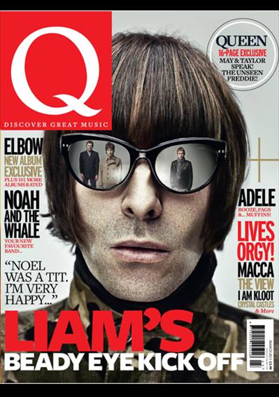


 How to Merge two things together, I used this by merging the polaroid and the image inside it together.


 I did not use Illustrator in my preliminary task so this was my first time, I only used it once and this was to create a star. What I did to my star on Illustrator is add more legs to it as their were previously 5. I also added a line colour, and changed the width of it, it was black and I changed it to red. I also added a fill colour to it and a show, I chosen yellow as it matched my colour scheme.

